
Mobile First Is Not Optional: What Happens When 60% of Your Visitors Hit a Broken Mobile Site
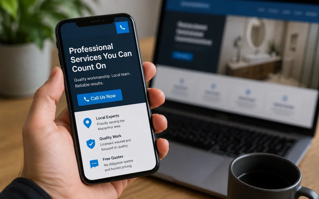
Open your website on your phone right now. Not later. Right now.
How long does it take to load? Can you read the text without pinching and zooming? Is the phone number clickable? Can you see a call to action without scrolling? Does the contact form actually work?
If the answer to any of those is no, you are losing customers every single day. And you probably do not even know it.
The Mobile Reality for Small Business
The majority of website traffic in Australia now comes from mobile devices. For local service businesses, that number is even higher. When someone searches “plumber near me” or “web designer Camden” on their phone, they expect the website they click on to work perfectly on that phone.
This is not a trend that might reverse itself. It is the established default behaviour. Google recognised this years ago and switched to mobile first indexing, which means Google primarily evaluates the mobile version of your website when deciding where to rank it. Not the desktop version. The mobile version.
If your website looks great on a desktop but is broken, slow, or frustrating on a phone, Google sees a broken website. And so do your potential customers.
What “Broken on Mobile” Actually Looks Like
When we audit websites for local businesses at our Camden office, mobile issues are some of the most common problems we find. Here are the ones that show up again and again.
Text that is too small to read
Content designed for a desktop screen does not automatically resize for a phone. If visitors have to pinch and zoom to read your text, most of them will not bother. They will hit the back button and try the next result.
Buttons and links that are too close together
On a touchscreen, small buttons placed right next to each other are nearly impossible to tap accurately. Visitors end up clicking the wrong thing, getting frustrated, and leaving.
Images that overflow the screen
Large images that extend beyond the edge of the mobile screen create a horizontal scrolling effect. This looks unprofessional and makes the site feel broken. Properly coded responsive images scale down to fit any screen width.
Menus that do not work
Desktop navigation menus with multiple layers of dropdowns often break on mobile. If a visitor cannot navigate to the page they need, they cannot learn about your services and they cannot contact you.
Contact forms that are unusable
A form that works fine on desktop might be a nightmare on mobile. Fields that are too small to tap into, dropdown menus that do not respond to touch, submit buttons that disappear below the screen. If your contact form does not work on mobile, you are losing the leads that matter most.
Pop ups that block the entire screen
Pop ups are annoying on desktop. On mobile, they can be impossible to close if the X button is too small or positioned off screen. Google has penalised intrusive mobile pop ups since 2017, and visitors penalise them by leaving.
How a Broken Mobile Site Costs You Money
The cost is not theoretical. It is measurable.
Bounced visitors
When a mobile visitor lands on a site that does not work properly, they leave. This is called a bounce. A high bounce rate tells Google that your site is not providing a good experience, which can push your rankings down further. It also means that every dollar you spend driving traffic to your site through SEO or Google Ads is partially wasted because the visitors you attract are not converting.
Lost phone calls
For service businesses, the phone call is the most valuable conversion. If your phone number is not prominently displayed and clickable on mobile, you are missing calls. A visitor on their phone who has to highlight your number, copy it, switch to the phone app, and paste it in is going through unnecessary steps. Most will not bother.
Lower search rankings
Google’s mobile first indexing means your mobile site is your primary site in Google’s eyes. A poor mobile experience directly affects your ability to rank for the keywords that drive business. You might have excellent desktop SEO, but if the mobile version underperforms, your rankings will reflect the mobile experience.
Damaged credibility
A broken mobile experience tells visitors that you do not pay attention to details. For a business that depends on trust, that first impression matters. A potential customer evaluating two businesses will choose the one whose website works properly on their phone over the one whose site is a mess.
What a Proper Mobile Experience Looks Like
A mobile optimised website is not just a desktop site that has been squeezed onto a smaller screen. It is a website designed with mobile users as the primary audience.
Fast loading
The site loads in under three seconds on a mobile connection. Images are compressed, code is clean, and hosting is quality. No unnecessary scripts, animations, or heavy elements slowing things down.
Readable without zooming
Text is large enough to read comfortably on a phone screen without any adjustment. Body text should be at least 16 pixels. Headings should be clearly distinct from body text.
Tap friendly
Buttons and links are large enough to tap with a thumb and spaced far enough apart to avoid accidental taps. The recommended minimum touch target size is 44 by 44 pixels.
Simplified navigation
A clean hamburger menu or a simplified navigation bar that works with touch. No complex dropdown layers. Important pages are accessible within one or two taps.
Click to call
The phone number is visible in the header on every page and is a clickable tel: link. One tap to call. No copying, no searching, no friction.
Forms that work
Contact forms have fields large enough to tap into, clear labels, and a submit button that is easy to find and press. The form is short, asking only for the information you actually need. Name, phone number, and a brief message is enough.
Content that prioritises mobile flow
On mobile, people scroll vertically. The most important information should be at the top: what you do, where you do it, and how to contact you. Supporting details like your story, your team, and your process come further down the page.
How to Test Your Site Right Now
You do not need a developer or paid tools to check your mobile experience. Here is a quick audit you can do in five minutes.
Test 1: Load your homepage on your phone. Time how long it takes. If it is more than three seconds, you have a speed problem.
Test 2: Read the text. Can you read everything without zooming? If not, the font sizes need adjusting.
Test 3: Tap the phone number. Does it call you? If the number is not clickable, you are losing calls.
Test 4: Open the menu. Can you navigate to your main service pages? Can you reach the contact page within two taps?
Test 5: Fill out the contact form. Complete every field on your phone and submit it. Did you receive the submission? Was the experience smooth?
Test 6: Check Google PageSpeed Insights. Go to pagespeed.web.dev on your desktop and enter your website URL. Check the mobile score. Anything below 50 out of 100 needs work.
If your site fails more than one of these tests, mobile visitors are having a poor experience and you are losing business because of it.
Responsive vs Mobile Optimised
A common misconception is that a “responsive” website is automatically mobile optimised. Responsive means the layout adjusts to different screen sizes. That is the bare minimum.
Mobile optimised means the site has been specifically designed and tested to provide an excellent experience on phones. The content hierarchy, the button sizes, the image weights, the load speed, and the user flow have all been considered for a mobile context.
A properly built website is both responsive and mobile optimised. Many websites are responsive but not optimised, which is why they look okay on a phone but still feel slow and frustrating to use.
Fix It Before It Costs You More
Every day your website delivers a poor mobile experience is a day you are losing potential customers. The fix might be as simple as compressing images and making your phone number clickable. Or it might require a more significant overhaul of the site’s design and structure.
Either way, the cost of fixing the mobile experience is far less than the cost of continuing to lose leads to competitors whose sites work properly on phones.
If you want to know exactly how your website performs on mobile and what needs to change, get in touch. We will run a full mobile audit and give you a prioritised list of fixes with no obligation. Your website should work as hard on a phone as it does on a desktop, because that is where your customers are.