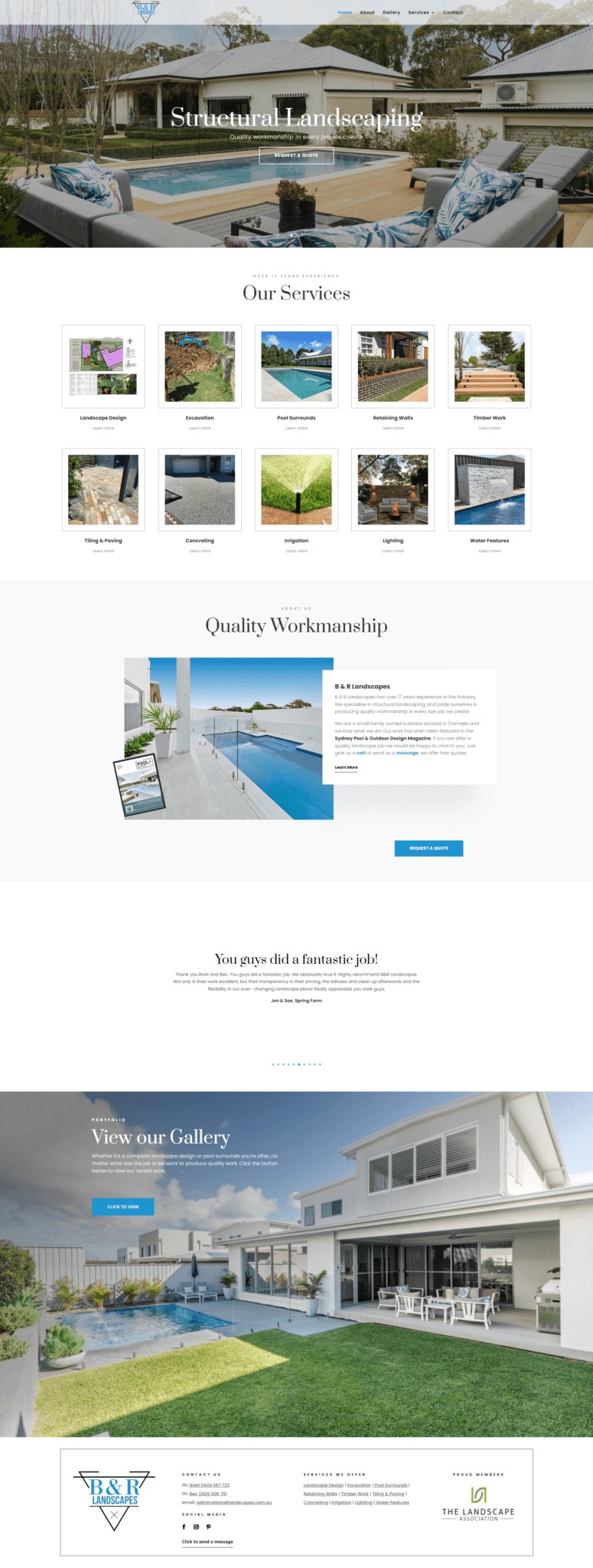
PORTFOLIO
B & R Landscapes
")

")
“You are amazing!”
The team at Online Optimisation helped make everything much easier then I thought it would be (kicking myself I put it off for so long but it was obviously meant to be) You are amazing at what you do and cannot thank you enough.
Rebecca Dinham
B&R Landscapes
Located in Camden B&R landscapes specialise in residential structural landscaping. They came to us needing a brand new website as they had no online presence. The website we built consisted of 5 pages.
B&R Landscapes do amazing work and we really wanted to showcase this in their website. That’s why the design we chose uses lots of full size images to really help capture their work.
The team at B&R Landscapes were fabulous to work with. I know they felt like this process was going to be very daunting especially being a brand new website with no existing content to copy. Though the site came together very smooth due to the processes we have in place. We were able to mock up a rough template and they helped fill in the blanks on each page. When it comes to content writing no need to panic on getting it perfect.
We give all our clients full admin access so they can make updates and edits as needed. We also offer training so clients know how to do all the basics themselves. Our training can be done over the phone, in our office or via videos. Videos is a popular option and one we recommend as it means you can watch them over and over so you are always confident in making website changes yourself. We encourage our clients to get hands on with their websites. If you break something that’s ok we can just roll your site back we take daily backups of your website to our cloud storage.
We look forward to working with B&R Landscapes and watching their online presence grow.
Device Friendly
When we launch a site we make sure it will look great on all devices. Including desktop computers, iPad tablets and mobile phone. Sometimes this means we add special custom tweaks that only get enabled at certain screen sizes, so the design of your website stays looking great. Certain aspects of your website we may remove on mobile view or visa versa. As part of this process its not about making your site look good on specific screen sizes but instead looking good on all screen sizes. This makes the page dynamically responsive to the screen size its being shown on. The page adapts and changes to fit the width and height it has available. This helps make the site friendly for users, but also it helps ranking better on Search Engines like Google. As part of SEO is making sure you are user friendly. Our end goal is that your site is aesthetically pleasing but most of all user friendly!
