PORTFOLIO
Finnco Structural & Civil Engineering Consultants


Finnco Structural & Civil Engineering Consultants
Finnco Structural & Civil Engineering Consultatants are based in Smeaton Grange. They are an Engineering Design & Consultation firm. This isn’t the first project we have created for our lovely client and as always they were a pleasure to work with. We love nothing more than repeat work from our existing clients. We really are passionate about online success and when you come on as a client we feel like you are part of our team. We are always happy to discuss your businesses direction and offer advice when needed.
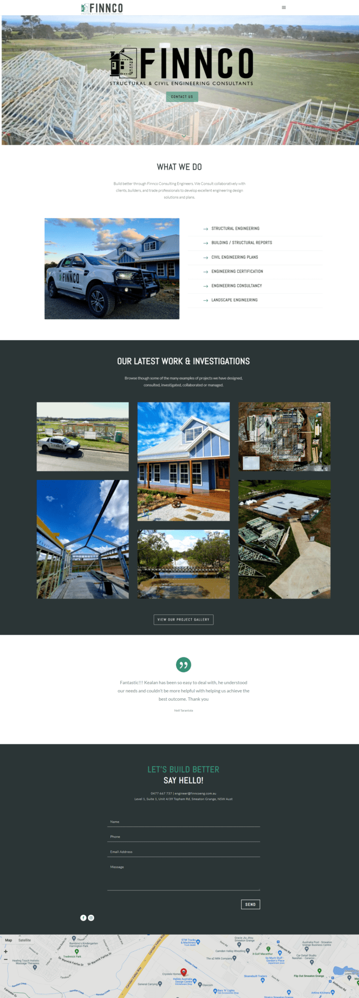
The website build went smoothly and the team at Finnco were well organised. They provided us with drone footage so we could create a video header on their home page and they also supplied great images of their work. Their work speaks for itself- they are very talented at what they do and it was lots of fun showcasing their images throughout their website.
This 5 page website consisted of their Home, About Page, Services Page, Contact Page and a Projects page. The project page will allow Finnco to create a portfolio of their work online. Not only will this be great for their clients to check out, but it also helps to grow their website’s pages- in turn, helping with their SEO. When it comes to websites, one of the best things you can do is to grow its content. Finnco understand this and this is why we created the project section for them.
We look forward to watching their prescence grow and we will be here to guide them and help them with advice and support when needed.
Device Friendly
When we launch a site we make sure it will look great on all devices. Including desktop computers, iPad tablets and mobile phone. Sometimes this means we add special custom tweaks that only get enabled at certain screen sizes, so the design of your website stays looking great. Certain aspects of your website we may remove on mobile view or visa versa. As part of this process, it’s not about making your site look good on specific screen sizes but instead looking good on all screen sizes. This makes the page dynamically responsive to the screen size it’s being shown on. The page adapts and changes to fit the width and height it has available. This helps make the site friendly for users, but also it helps ranking better on Search Engines like Google, as part of SEO is making sure you are user friendly. Our end goal is that your site is aesthetically pleasing but most of all user friendly!