PORTFOLIO
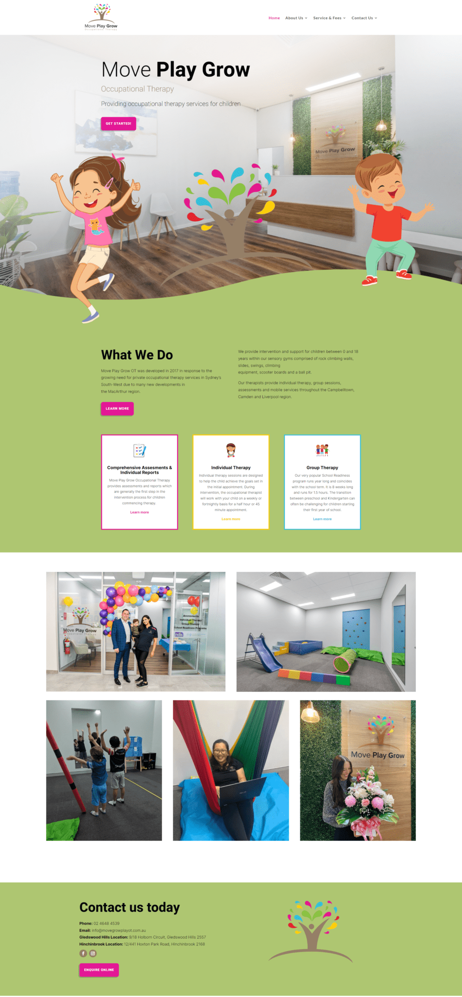
Move Play Grow Occupational Therapy
")

Move Play Grow Occupational Therapy
Move Play Grow Occupational Therapy provides occupational therapy services for children. They are located in Gledswood Hills and Hinchinbrook.
This site was super fun to create. The colours we chose for the site were colour matched to their branding and being a site for children we had a little fun with the design. The website consisted of 8 pages and the site build came together well due to the processes we have in place.
We often get clients hesitant to build a website as they are worried about the amount of time and effort they will need to put into the build. But what they don’t realise is when we build a website we try and do as much of the work as possible. Yes, we need help with the content, but it actually comes together quite quickly. If you aren’t sure what to put on a page, we will create you a template layout of what we feel you may want or need and you help us fill in the blanks. No pressure to get it right either, as on launch we give you full administrator access and encourage you to get involved and use your website.
Our training packages show you how to use your website and how to do all the basics needed to update your content. If you get stuck that’s ok, we are always happy to jump in and help and guide you at no extra cost. We don’t want your website sitting idle, we want you to add content, use it and get the most out of it! Your website can be a great marketing tool and if used correctly, can be a big factor in the success of your business.
Move Play Grow Occupational Therapy has been a pleasure to work with and we look forward to helping them grow their online presence.
Device Friendly
When we launch a site we make sure it will look great on all devices. Including desktop computers, iPad tablets and mobile phone. Sometimes this means we add special custom tweaks that only get enabled at certain screen sizes, so the design of your website stays looking great. Certain aspects of your website we may remove on mobile view or visa versa. As part of this process, it’s not about making your website look good on specific screen sizes but instead looking good on all screen sizes. This makes the page dynamically responsive to the screen size it’s being shown on. The page adapts and changes to fit the width and height it has available. This not only makes the site friendly for users, but also helps it to rank better on Search Engines like Google, as part of SEO is making sure you are user friendly. Our end goal is that your website is aesthetically pleasing but most of all user friendly!